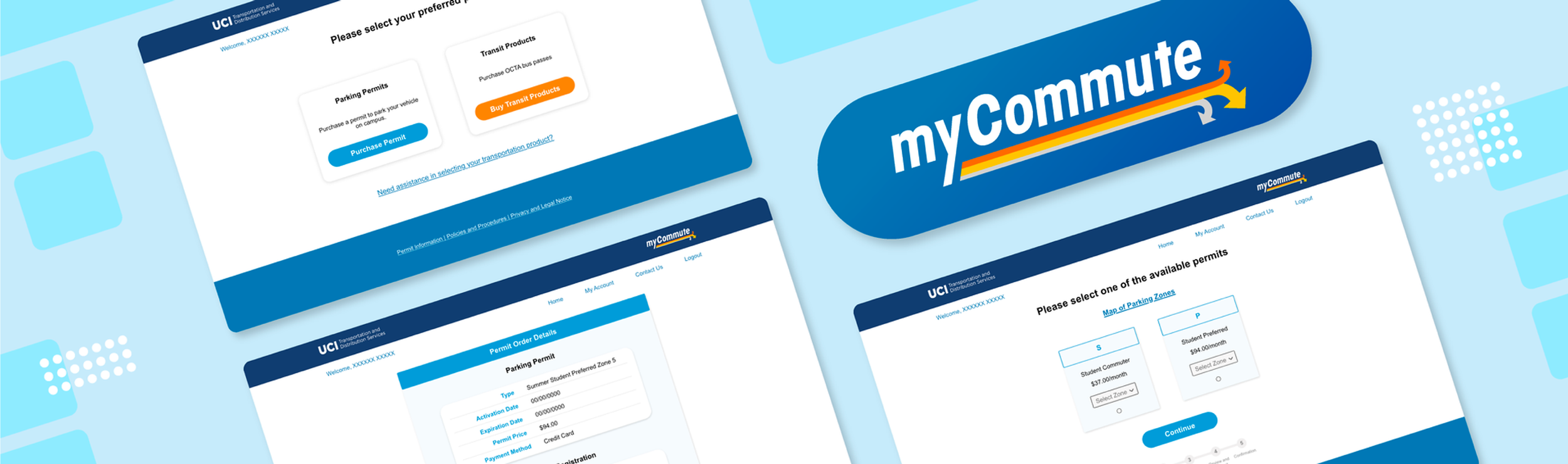
MY-COMMUTE
Transportation Service Web Page
ROLE
UX Researcher, UI Designer
TOOLS
Adobe Illustrator, Adobe Xd, Miro, UsabilityHub
TIME
6 weeks
BRIEF
MyCommute is an online portal that UCI Transportation has created to process faculty, staff, and student parking permit sales, sustainable transportation membership applications, and transit product orders. This online portal consists of both mobile and web versions, which aims to create a safe and convenient experience for all users.
CONTEXT
Due to Covid-19, the campus will no longer be issuing physical permits for faculty, staff, and students. All faculty, staff, and students will be using the MyCommute online portal to purchase and register their parking permits and memberships. I was tasked with providing a new mobile and web design that would allow new users to make their purchases without too many wordy instructions, and allow old users to make their purchases fast and simple.
RESEARCH
COMPETITOR ANALYSIS
To get a better understanding of the competitor landscape. I conducted analyses on two of the most popular transportation apps on the market and found that while both provided a wealth of information for users about the products they offered, there was some information overload. This could prove overwhelming for some users, especially those new to the products.

SURVEYS & INTERVIEWS
To understand how faculty, staff, and students made use of all the transportation options, and the issues they were facing. I surveyed 30 old users, including professors, staff, and students. I wanted to understand how users are making different decisions when purchasing the products based on their locations and jobs.
DEFINE
PROBLEM STATEMENT
Users of MyCommute need a way to find easily understandable instructions for each step of purchasing. In addition, overwhelming information should be separated into multiple short steps because users lose their concentration when each step is too long.
USER PERSONAS
Since one of the key findings from my user research was that users of varying familiarity with the purchasing process have different needs, two user personas were created - namely for a new incoming student and an experienced faculty member. I revisited these user personas often in order to remind myself of the needs and frustrations of my users, and to maintain a user-centric focus for the duration of the project.

MENTAL MODELS
Using all of the research collected, I created a mental model for each user persona in order to understand how the user might interact with the app, and to create a more intuitive user experience.


SITE MAP
With these core features in mind, I conducted a card sort to gain insight as to how users might expect the content to be organized and displayed, and used the results to create a sitemap.
IDEATION & TESTING
IDEATION & TESTING
LOW FIDELITY WIREFRAMES
Since simplicity and ease of use are one of the biggest aims of MyCommute, the number of screens and steps were kept to a minimum and I wanted to focus on highlighting the core features. I started with pen and paper wireframes, and created multiple versions of each screen until I found a combination of features and elements that I thought matched the users needs and that would be as intuitive as possible.


USABILITY TESTING
This phase was the game changer - by conducting usability tests, I was able to refine what users were finding useful, and completely change up what they didn’t react well to. The users were asked to complete a few scenario-based tasks that would test the main features of the app, and were asked how they felt about the app in general. The results of the usability tests were recorded and analysed using a rainbow spreadsheet and an affinity map.
KEY FINDINGS
I made notes of the positive and negative feedback, so that I knew what areas to keep expanding upon and what needed to be reworked.

ITERATE

DESIGN CHANGES
I made changes based on the user feedback and then reached out for additional feedback from some fellow designers. I created a high-fidelity version of the app that featured more white space, icons and clearer text.
To this design, I applied the Cestalt Principles, colour theory and made use of grids to ensure consistency within the entire app.

DESIGN SYSTEM LANGUAGE
Lastly, I created a design system language that could be followed in the future to ensure consistency throughout the app.

CLEAR PRODUCTS
Based on the feedback that permit is the primary product that customer are looking for, I decided to simplify the page with just to item. In addition, I assigned different color to each of them to give a specific identity to each thing.

PRECISE SUMMARY
Based on the feedback that users had a hard time finding the information about their purchase, I decided to add a confirmation section with a clear detail of the product description.

REFERABLE MAP
Based on the feedback that users had a hard time searching for the correct parking location, I provided a link of the zone map.
RETROSPECTIVE
EMBRACE AMBIGUITY
Instead of diving straight into the prototyping process, I learned to be patient and break down research questions. The most valuable insight that I learned is from the interviews, which gave me a clear picture of the answers from the survey. After creating the overall flow and revisiting the designs, it really helped me to bring clear communication to this project..
GOING REMOTE
This project took place during Covid-19, where everything started to go virtual. Feedback and usability testing became challenging as the team was handling a drastic shift to an online work environment. However, with the virtual interviews and communications between different people, I developed a greater skill in improving virtual communications.